Brand Identity & Design System for a Gen Z Fashion Label
My Role: Brand story development, design system architecture, and multi-platform implementation. Behavioral mapping, visual identity, typography system, color strategy, and brand execution across 30+ surfaces.
Deliverables: Logo system · Type scale · Color palette · Motion principles · Design tokens · Component library · 30+ mockups
Approach: Behavioral mapping → Audience insight → Visual language → System → Execution
A new Gen Z fashion label needed a complete visual identity: logo, type system, color, motion, and brand language across digital and physical surfaces.
The brief was simple. The design problem was not.
This audience rejects both available options. Minimal branding reads as corporate and safe. Fully chaotic branding becomes unrecognizable and unwearable. The actual challenge was building a system that lives deliberately in the tension between those two extremes — expressive enough to feel alive, structured enough to hold together at scale.
That tension is not a compromise. It is the brand.
Before a single color was chosen, I mapped how this audience actually behaves with fashion — not what they say they want, but what they respond to and why.
Gen Z doesn't consume fashion passively. They perform identity through it. Every item they buy is something they carry, wear, or post — a public statement about who they are. That changes the design brief entirely. The brand doesn't just need to look good. It needs to feel worth performing.
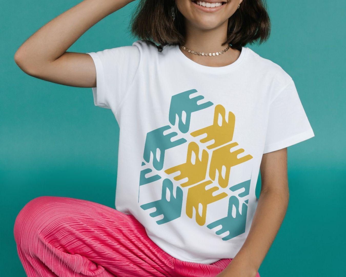
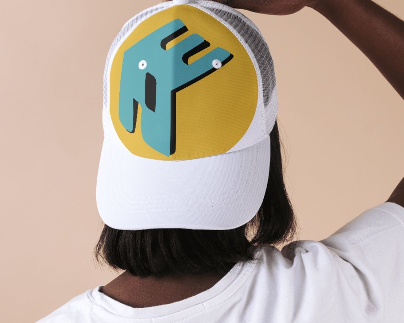
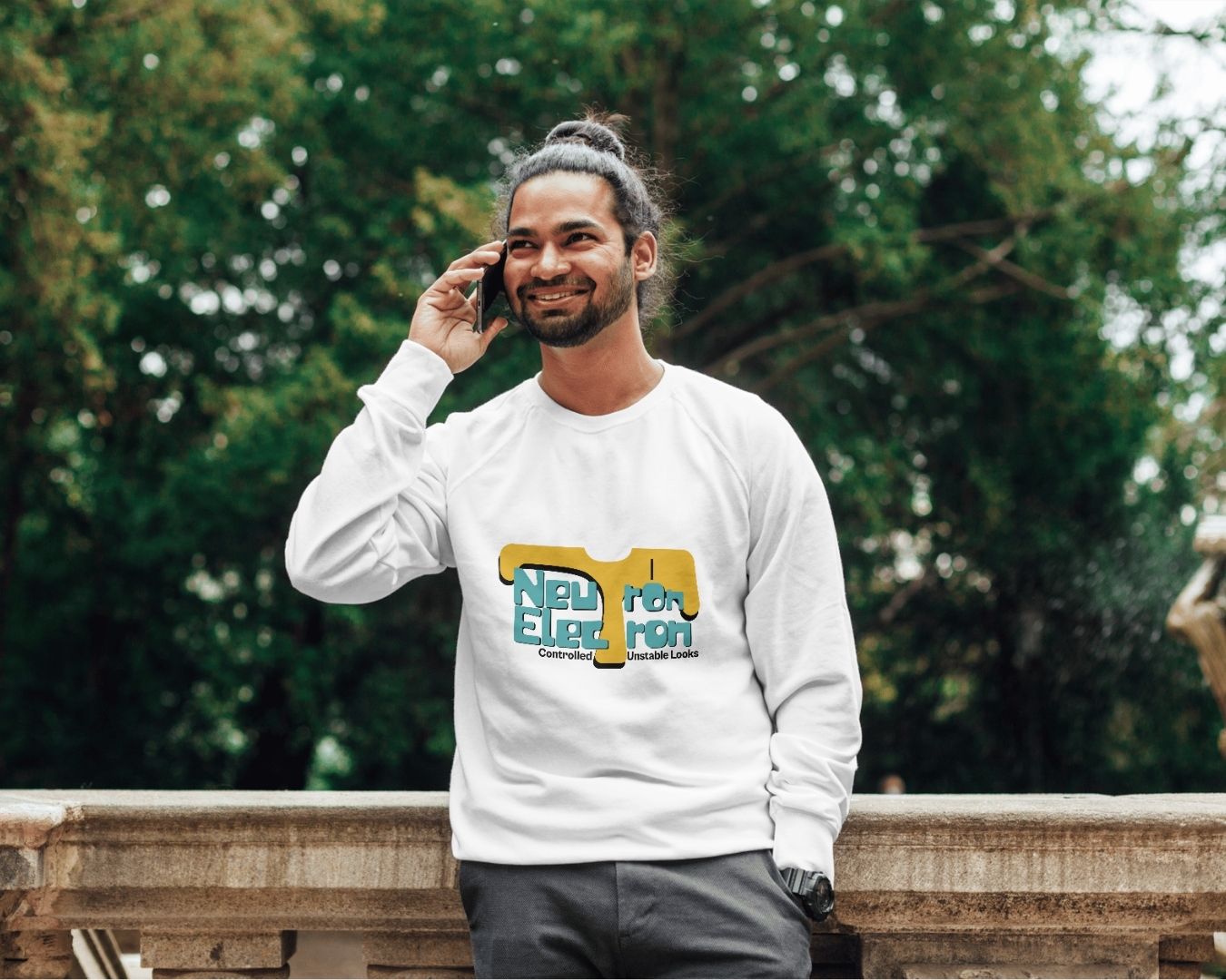
The final identity balances expressive movement with sharp structure. Bold, scalable, and immediately recognizable across Instagram, packaging, signage, and print. The system adapts to every context while maintaining a distinctive voice.
The brand never looks exactly the same twice, but it always looks like itself.